With a few hundred CRM projects behind me, one way or another, there's one thing that always catches my eye: how much the customer support portal gets underestimated. Especially by companies rolling out a CRM for the first time, coming out of the world of shared inboxes and Excel spreadsheets.
And the portal tends to be the most visible part of the whole project. The end customer never sees the automation that routes the tickets, the SLA you configured, or the manager's report. But the portal they see, and use.
How many times have you done exactly that? Landed on a company's website trying to solve a problem, hoping you wouldn't have to call or send an email? I do it all the time. The last thing I want is to be stuck in a phone tree or wait days for a reply. If the site helps me solve it fast, I'm already happy. Opening a ticket is always the last resort.
That's why I decided to write this article: to gather the wins and the mistakes I've seen, and a few I've made myself, over years of configuring support portals. The idea is that you build yours to give the customer the best possible experience. With a huge bonus for your operation: every problem the customer solves on their own is one less ticket in your team's queue.
The mistake nobody sees
In a lot of CRM implementation projects, the support portal is given away for free.
The consultancy builds the proposal, prices the automations, the integrations, the training, and the portal goes in as a courtesy. And it makes complete commercial sense, because the customer's perceived value of the portal, before the project starts, is close to zero. Whoever is signing the contract wants to solve the internal pain: organize the queue, stop losing emails, get reports. The portal looks like a detail.
That perception flips completely once the CRM goes live. As silly as it sounds, one link on the home page pointing to the portal is enough, and customers find it. And they try to sort themselves out before making any contact. All of a sudden that "detail" becomes the support channel with the most traffic in the operation.
The problem with treating the portal as a courtesy is that it ends up configured like one: in a rush, at the tail end of the project, with nobody discussing content or visual identity. Testing? Forget it. And the company loses exactly the layer of the project that would work for free on its behalf, 24 hours a day, cutting tickets.
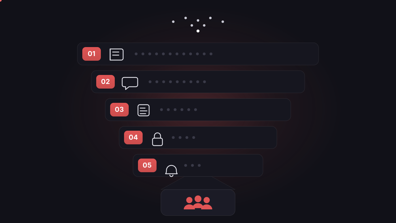
The good news is that structuring a well-built portal isn't complicated. In my projects, I organize it into five layers.
The portal in 5 layers
Think of the portal as a funnel: the customer starts out trying to solve it alone and, only if they can't, move on to direct contact. Each layer intercepts a share of the tickets before they reach your team. The earlier the customer solves it, the better for them and for your queue.
Layer 1: Knowledge base
The front door of self-service, and the layer that intercepts the most tickets. These are the articles that answer the most frequent questions: how to get a second copy of an invoice, how to reset a password, what the delivery window is, how to request a refund. The customer searches, finds it, solves it, and leaves without opening a single ticket.
The classic mistake I see is a knowledge base written from the perspective of someone inside the company, with internal names for processes and systems. The customer searches for "second copy of the bill" and the article is called "Invoice reissue." The result: they don't find it, they give up, they open a ticket. Write in the customer's words. And you don't have to guess what those are: the most recurring subjects in your tickets are your content agenda.
Another piece of advice from someone who got this wrong: start small. Ten articles that actually solve something are worth more than a hundred shallow ones published just to fill the shelf.
Layer 2: Chatbot and support widget
Not everyone wants to browse and read an article. Some customers would rather ask and be guided to the answer. That's where the widget comes in, that floating bubble on the pages of your site, with a chatbot behind it.
A good chatbot does two things: it resolves the simple flows end to end (status checks, frequent questions, step-by-step guidance) and it suggests knowledge base articles before letting the customer open a ticket. It's self-service's second chance to work.
The mistake here is well known too: the chatbot that only knows how to answer "I didn't understand, please open a ticket" annoys more than it helps, and it stains the reputation of the whole portal. Prefer five flows that actually resolve to fifty that stall. And always with a clear, easy way out to a human agent.
Layer 3: Support form
When self-service can't handle it, the customer opens the ticket. And the form is where you gain or lose time from there on.
The goal of the form is to avoid the second and third contact on the same ticket. That ping-pong of "can you give me the order number?" and "can you send a screenshot?" is invisible volume in the queue: every round trip adds resolution time and messages for the team to process, and the customer gets more frustrated.
The technique I use is the conditional form: the fields change depending on the type of request. A billing problem asks for the invoice number. A technical problem asks for a description and an attachment. A sales request asks for something else. Fewer fields convert better, but the right fields save round trips. Finding the balance between the two takes a few rounds of testing.
Layer 4: Logged-in area
Up to here, everything can happen without the customer identifying themselves. The logged-in area is the authenticated space where they find what's theirs: request history, account details and, depending on the business, contracts, invoices, orders, policies.
In my experience, a huge share of the tickets in any operation is pure information lookup. "Where's my invoice?", "what's the status of my order?", "who's my account manager?". None of those questions need an agent. If the customer finds the answer logged into the portal, the ticket never even gets born.
The logged-in area also improves the other layers: with the customer identified, the form comes pre-filled with their data, and their history gives the team context on the rare occasions a ticket really is necessary.
Layer 5: Ticket tracking
The transparency layer. Once the ticket exists, the worst thing you can offer the customer is silence. A customer with no visibility calls, sends emails and, at the limit, opens another ticket to ask about the first one. Now you've got duplicate tickets in the queue and messy reporting.
What fixes it is clear status, visible in the portal, with a notification on every change. The customer opens their area, sees "under review by the finance team, updated today at 2pm" and goes back to living their life.
In the projects I've been part of, a meaningful slice of any queue's volume is follow-up: people asking "so, any news?". Visible status kills that volume at the source. It's probably the layer with the best ratio between configuration effort and tickets avoided.
UX: the portal has to feel like yours
Configuring the five layers is half the work. The other half is making the portal feel like part of your company.
Every support system ships a factory-default portal: functional, generic, and wearing the vendor's face. Tiny logo, default colors, an address like yourcompany.system.com. Does it work? It works. But think about the experience: the customer was on your site, surrounded by your brand, and by clicking "Support" they land in an environment that looks nothing like where they came from. It feels like they left your company. In the most extreme cases, I've seen a customer suspect it was a scam and give up on the ticket. Only to call later to complain, of course.
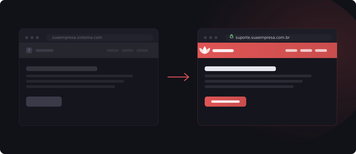
The brand checklist is short and cheap next to the damage it prevents: your own address (support.yourcompany.com), the company logo and colors, consistent typography, a tone of voice in the articles that matches your other channels. And a visible link to the portal on the home page. Yes, that silly little link from the start of the article.
What your team gets out of it
So far I've talked about the customer's experience. Now let's go to the manager's side.
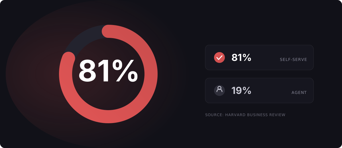
A study published by Harvard Business Review found that around 81% of customers try to solve the problem on their own before reaching out to an agent. In other words, your customers already behave this way today. The question is whether your company offers a path for that, or pushes everyone into the same ticket funnel.
And the market is heading the same way: a Gartner survey run in October 2025 with 321 customer service leaders pointed to self-service success as one of the top priorities for 2026, alongside customer satisfaction and operational efficiency, with knowledge management gaining weight at the companies expanding this front.
In the day-to-day of the operation, the repetitive questions stop at the knowledge base and the chatbot before they turn into tickets. With a well-designed form, the tickets that do come in arrive complete, and the team resolves them on first contact instead of hunting for information. The analysts stop answering "where's my invoice" forty times a day and start working the complex cases, which is where human support makes a difference. And good people don't quit out of boredom.
Before you publish: the QA checklist
One last lesson, learned the hard way: the day I've seen portals break the most was launch day. The link nobody clicked, the notification nobody checked, the form nobody tested on a phone. Before you announce the portal, test it as if you were the customer.
Functional
- Open a test ticket through each form and check that it lands in the right queue, with every field filled in
- Confirm the notifications: does the customer get an email on opening, on reply, and on closing? Check the spam folder too
- Click every link in the knowledge base and the portal menus
- Walk through the chatbot flows end to end, including the handoff to a human agent
- Test account creation, login, and password recovery
Devices and browsers
- Browse the entire portal on a phone, because a good chunk of the traffic comes from there
- Repeat on the main browsers: Chrome, Safari, Edge, and Firefox
- Watch the load time, especially on pages with images
Content
- Reread every published article: are the screenshots up to date? Is the process described still the real one?
- Standardize the titles and the tone of voice across articles
- Proofread the spelling, because a single typo drags down the credibility of the whole portal
- Make sure no test article or draft got left published
And my favorite test for the end: grab someone who wasn't part of the project, give them a mission ("find how to request a refund") and just watch, without helping. Wherever that person gets stuck, your customer will get stuck too.
Closing the loop
After hundreds of projects, if there's one pattern I've learned to respect, it's this one: the portal is born underestimated, goes into the proposal for free, and ends up the most-visited channel in the operation. Because deep down all of us, me, you, and your customer, would rather solve it ourselves, fast, without talking to anyone. Opening a ticket is always the last resort.
If you're rolling out a support system right now, or you already have one running with the portal in that "factory-default" state, I hope this article serves as a map.
Where to find a portal like this
You do not build it from scratch. Freshdesk, Freshservice and Zendesk all ship a customer portal inside the helpdesk, on your domain, with your logo and theme, and the five layers above are configuration, not code. If you want it set up by a Freshworks implementation partner, that is the work we do.
And if you want to talk through the portal of your own operation, just reach out.
Leandro is the founder of Red Lotus Tecnologia, specialized in implementing, supporting, and evolving Freshdesk for support teams in Brazil.
Sources cited in this article
- Dixon, M., Ponomareff, L., Turner, S., DeLisi, R. "Kick-Ass Customer Service." Harvard Business Review, Jan–Feb 2017. hbr.org
- "Líderes de atendimento ao cliente estão sob pressão para implementar IA, diz Gartner." Inforchannel, Feb 2026. inforchannel.com.br